PHOTOS FROM THE SHOOTS

At various times during this project I had to go out to take some photos of my friends wearing the head. Whether this was with or without any purpose, I want to show you some of my personal favourites from the over 1000 photos that I took.

So here you go!

HOW TO: MAKE A PAPER MACHE HEAD

Here’s a somewhat concise tutorial on making a cardboard head for your FMP, or your cosplay, or whatever you may need a paper mache head for.

Anyway, you’ll need:

  • Base for head (mine was a cardboard box, and it fit my whole head inside)
  • Scrap newspaper
  • Paper (coloured or white, tissue or cartridge)
  • PVA glue (I used a lot less than I expected, despite the box being big)
  • Container (for mixing glue and water)
  • Cheap helmet, like for kids (mine was a pound from Poundland, but it fit my head)
  • Hot glue (gun)
  • Spray paint
  • Accessories for your head (mine were painted CD’s)
  • Painting accessories
  • Acrylic paints
  • Craft knife / scissors

Here’s a pro tip: I wanted mine to have holes for eyes (not for seeing, just for aesthetic). But if you’d be going to a con you should make sure you cut out your holes out of the box before you start the process. Because from experience, cutting through two layers of newspaper and cardboard kills the man.

After that, pour some PVA into a container, and add some water (like a 2:1 ratio of glue to water) and mix. Then, tear your scrap newspaper into small pieces, and grab a paintbrush that you don’t mind destroying. Dip scrap newspaper into your mixture, and stick onto your box. Below is 1 layer.

IMG_6244

Then, you do this again, until you reached your desired thickness. I’m impatient, so after one layer and a full dry, I only added one more or so and then patched up any spots.

If you’re like woah wait, eyes? Yeah, they’re covered up with blue acetate so that I could mark them out. I removed that later, as it wasn’t really necessary. But if you want to add some character to your mask, I just cut and glued together cardboard, stuck it onto the box and paper mached both together so they’d attach. If you really want them to stick, you could also use PVA when attaching the accessory, because then it gives you a more stable surface to stick newspaper onto.

I was going to spray paint mine silver, so I used white cartridge paper for my next couple of layers. You repeat the process, but maybe make your mixture have more glue in it. Thick paper doesn’t stick as well (if you’re using tissue, like for a mask, you’re fine).

MAKE SURE IT’S DRIED BEFORE PROCEEDING

Okay, so now comes the spray paint. Take it outside, wear a protective mask (I also wore goggles because it looks cool) and lay out some newspaper if you’re doing it on grass. Put your box on there and carefully apply light coats of spray paint all over. Remember, multiple light coats look better than a thick one, so keep your distance. 

This was after the box had AIRED (been left outside for a whole day + night with the air able to access the inside of the box as well) and been bought inside.

See here, the acetate at least protected the inside of the box from getting painted as well, so I guess it had a purpose?

I then stuck on my CD’s (which I had painted using acrylics) using a LOT of PVA and patience because they kept moving about.

Ok so next, you take your (in my case, black and white) acrylics and you add highlights and shadows to the mask. Having a base colour is good but remember that to make something look realistic you should have some light and dark places too. (It’ll look better, trust me). My painting process took a couple of days because my hands kept cramping and I wanted it to look perfect, but I started with shadows (black/grey) first, then highlights (light grey/white) and then added as I needed.

Of course, please tailor your highlight and shadow colours to your desired effect.

After these had dried, I also decided to use a permanent marker (and some other fineliners) to add details onto the head. Mine consisted of little metal looking parts all around, but yours could be anything you want it to. If I was to make mine again I’d probably use my paints for this, so that’s something you might want to consider doing, depending on how you want your mask to look.

After that, get your helmet and hot glue it onto the inside of your box (make sure it’s facing the right way and is on tight) and get ready to wear your new mask!

Let me know how you get on, or like if you used this tutorial.

GLITCH LINO PRINTS

But Taylor, haven’t you already made some prints?
Yes, but that did not stop me from developing my initial work much, much further.

I got the idea after a group crit, where someone suggested I should take the Photoshop ‘warping’, apply it to one of my 100 visuals, and then recreate it again as a print.

So it started by me scanning my favourite print (the one of my head as a robot) and then very quickly making a pleasing edit of it.

Here are the original source images, and the finished pieces.

I then proceeded to convert these into black and white drawings on paper, as a sort of template for my lino cut.

And the lino plates!

Which then resulted in these lovely prints. Now, the colours are limited because I was working towards a certain colour palette. But if you see flashes of yellow and metallic ones, that’s called experimentation!

This was an incredibly fun process, because I also discovered that metallic inks exist! Even the overlaying prints gave an incredible effect, and it helped me generate more ideas.


100 (+4) VISUALS

When I was going to post this, I debated with myself whether to start with the weakest first or last. But as my teacher’s voice in my head yelled out “Good first, then mediocre, then fantastic.”

So let’s use that format.

These are my prints, the first set is the drypoint set, and the others are lino cuts, my favourite printing method.

I mean, you can definitely see the progress here.

There’d be more here if they let me have more than 15 for each technique.

But then again, that would result in 100 prints.

Next will be some statistic related visualisations, as well as some marker work.

These are also some of my earlier visualisations, if you hadn’t noticed!

I also made some tracing paper and paper collages. I found these to be surprisingly fun, as it’s a really abstract way of working but, you’re in control at the same time. If that makes sense.

Next will be screenshots from an animation and incredibly, incredibly simple icons that communicate my theme and other types of work quickly.

Next are seriously some of my favourite methods of visual communication, typography and photography. I adored working with these because it gave me a lot of freedom, but also made me think long and hard about how I’d like the final piece to turn out, especially with composition.

The first one is what my initial drafts of these looked like: really bland.

I love these with all my heart.

Finally, here are all of my digital manipulations. 3 types to be in fact.

We’ll start with the textured ones, then onto glitches of my tracing paper collages, and finish off with my strongest work, digital object heads.

My feedback was very strong, but my improvement point was to use more original images in my work (working on it, believe me).

So if you stuck around till the very end, hello and thank you very much for looking through! I plan to develop the lino prints and the object heads, so be sure to look forward to that!

VISUAL EXPLORATIONS

My theme for this FMP? Artificial Intelligence.

love robots. They’ve fascinated me for years and I’ve made some simple circuits out of some DIY kits that drive around my table. But I’m also fascinated with how they are going to develop in the future.

In any case, our first task was to do really quick and easy visuals to do with our theme.

  • 5 of them were with circles:


  • 5 of them were with triangles:
  • 5 of them were just vertical lines:
  • 5 of them were geometric shapes of our choice:

In my defence, these were done before my concept was finalised and narrowed down.

We also had to draw 9 number related visuals, which didn’t have to link to my theme. Here are those:

So after those and group feedback, we had to choose 10 and rework them. My main feedback was really good, actually, apart from making some lines neater and using more colour and tone in my work.

This is the result of that feedback:

And as a bonus, we also had to do 4 A4 visuals to do with our theme (it was a really busy week):

But that was it! And now we got onto the next task, which somehow involved me making even more work.

And believe me, it was even harder.

I’ll probably upload those as soon as they get marked, so look forward to that!

30 (26) DAY CHALLENGE

So, we had some free time. My friends and I at college wanted to challenge ourselves with doing our own, hand-crafted 30 Day drawing challenge. I managed to keep up with it until Day 26, and then my hand just refused to work.

It just wouldn’t.

So now here I am to show you the 26 drawings that I made, and whilst they are quite rugged and messy, they only took me maybe 20 minutes each day. So this is more of an update with my art rather than something professionally handmade.

Organised day by day for your viewing pleasure. Apologies for the brown paper, it is the sketchbook I bought as I wanted to try drawing on a different type of paper.

But if I was to do this challenge again (and I definitely want to, it forces me to practice drawing every day and each theme is great) I’d want to stick to it till the very end, and look back through it to see whether I made any improvement over the weeks or not.

3D Typography

So what I really, really wanted to avoid in this micro brief was making something that valued form over function more.

And yes, I absolutely got motivated to do this after getting pissed off at Alessi’s rocket juicer.

I wanted to make 3D Type with a purpose. The 6 characters we got tasked with making did not have to relate to one another, but we had to make:

  • Capital letter with an Apex
  • Capital letter with a Counter/Bowl
  • Lowercase letter with an ascender
  • Lowercase letter with a descender
  • Punctuation mark

The last one was really our own choice.

My capital letter with an Apex was W, which very nicely reminded me of a magazine rack.

My other capital letter was P, and as an avid fan of plants (succulents and cacti) I decided to make a model plant pot and proceeded to grow cress in it.

Look at it g(r)o(w)!

As for the lowercase ascender, the b I had the most problem realising. Because first I wanted to make a C-eat out of C’s but then that turned into a b chair, which then went into a B’ench. Eventually though, it all worked.

The other lowercase, the descender, was no problem because I had quite a clear vision of what I wanted it to look like: a bookcase or shelf. So I took some wooden 8mm sticks and went to town on them with a handsaw and hot glue.

And fun fact, it actually stood up by itself, most of the time.

The punctuation mark was fun to model, as I wanted to make an exclamation point and use it as a notice board. Of course, modelling this out of paper was nothing short of hell with all the measurements and the net. It also taught me to not listen to my tutor because he told me it would work better as a hexagonal structure rather than a circular one. He, however, proceeded to announce his leave to the college shortly afterward.

My wildcard was my most ambitious project, as I really, really wanted to make a lamp. I started with the idea of a lampshade, but soon wanted to absolutely make a functioning lamp. Thanks to my dad, IKEA and B&Q, I was able to make my final 3D type over the weekend.

People, I present to you the 8 lamp.

It was, extremely fun to work on this, especially since I could get help from my dad on shaping and purchasing the necessary materials. And it does actually function! Which is nice.

But to those yelling out for my graphics skills, no worries. Now is your time to look at my visualisations of the products.

p1200772edited-y2-1

And also, some compositions that I’m very happy with (especially the colours):

Overall, one of my favourite micro briefs. I absolutely adore typography and the theories and aesthetics behind them.

I’m now looking to progress to the Graphics specialism at my college for this and the upcoming year, hopefully I can keep updating you on that!


3D

This was another one of shorter briefs from college, with 4 weeks to it’s name. The first 2 were really quite, teaching heavy because we had to grasp the concept of perspective, scale drawing, comparison etc.

So we started with the absolutely wonderful still life drawing of an abstract sculpture. Now I don’t know if you’ve noticed but I’m, not one for great realism in my drawings. However, I thought that these were actually quite okay. Of course now I see a ton of mistakes in the drawings, but that’s what happens when you look back at old art.

We then moved onto perspective drawing. I did one of the college of my hallway but let me tell you, after my tutor first explained two and one point perspective I felt like I had never done it before in my life. Which I had, and it left me really confused. But let me tell you this apart from the horizon line line being way up there, I came to really like this drawing.

img_3884

After that, we made abstract 3D sculptures out of different materials such as wooden dowels, paper straws, florists wire and thick wire, cardboard. Things of that nature. Mine, I think, turned out pretty sweet so I took a lot of photos of them.

From there, we got told to make observational (but also abstract) drawings from the sculptures we had made.

Some of these you do have to click on to see, mainly because we had low light in the studio, and the pencil was very faintly drawn on.

Other than that, I did very much enjoy the first weeks of the brief because it gave me a chance to experiment with different materials and adhesives, as well as different ways of representing that on paper later.

DIGITAL PATTERNS

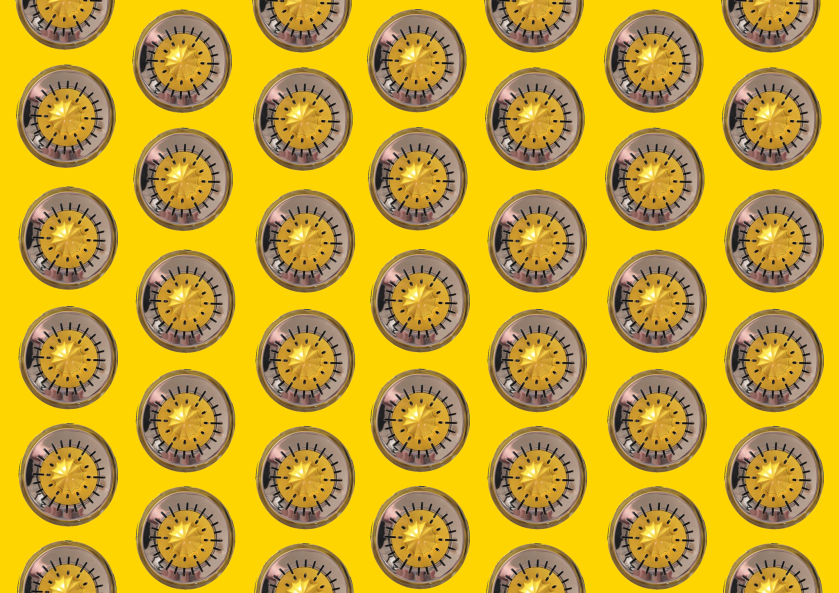
I have been trying a lot of new things over the Christmas break (Happy Holidays, by the way!) and one of them was photo editing, yet again.

Only this time, I actually decided to also try making my own patterns out of those photos. So, I’d start with pictures like this:

And then promptly go to the Magic Wand tool on Gimp and crop them out until I only had the transparent bits left.

Out of that, I started arranging the objects on the page in different ways, until I was satisfied with the layout and the rotation of each of the objects.

Whilst this post is still a work in progress (I’ll be adding more), this was a really good way to practice making simple patterns and furthering my knowledge of the software.

15877893_1848704685344105_855433611_o-115857567_1848704972010743_466476712_o15878335_1848704975344076_1423632441_o